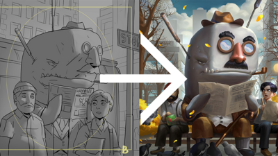
The first thing that grabs a player’s attention in our game is the artwork, but they never get to see all the in-between stages of illustration. That is to say – until now!
Our fantastic artists help us bring the characters to life, but each one has a different style and creative process, so for each one, we have a slightly different approach for getting to a final piece of artwork that fits within the larger ScreenPlay universe.
In all cases, we start the art process by giving the artist a brief for the artwork as well as references for inspiration. The brief emphasizes the premise of the character and the comedic elements that we want to highlight in the artwork.
This is the description of Officer Moby given to our artist Kevin Sidharta:
- An albino whale who is an undercover cop, trying to look inconspicuous but failing hard, because he’s so obviously Moby Dick. That’s the core premise and humor in this artwork.
- He could be wearing a trench coat and a hat, have tiny sunglasses that don’t even cover his eyes, and he could be reading a newspaper, that, again, doesn’t cover much of his face.
- The newspaper could also have funny headlines and stuff.
- He also has a harpoon or two stuck in him that shows he’s doing an even worse job of being undercover.
- Also place a character or 2 around him to show how big the whale is compared to them.
After receiving the brief, the artist draws a couple of sketches. In the case of character and crew cards, they place the art into the template that roughly tells us how much of the artwork will be seen when the character is in play (aka on set)
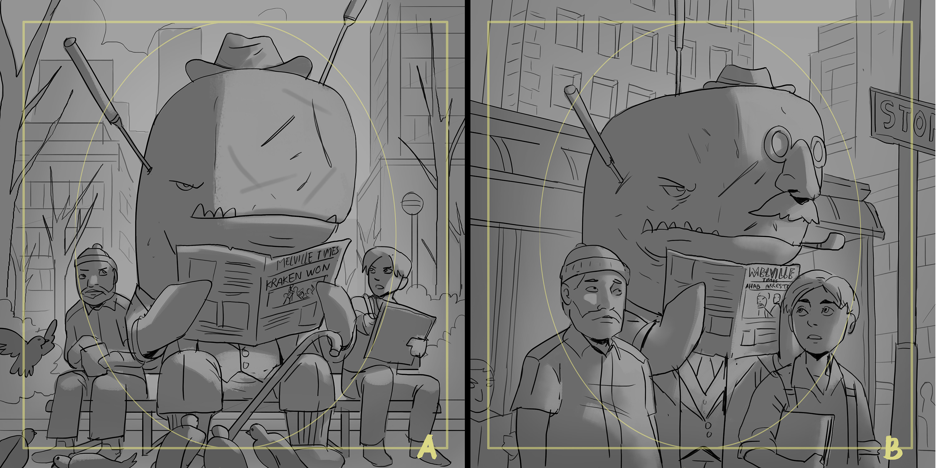
We liked the composition of sketch A, but Kevin’s idea of having a fake nose and glasses was too fun to pass up, so we asked him to incorporate it into the image. The idea that a disguise like that would fool anybody is just so deliciously absurd. This was his updated sketch:
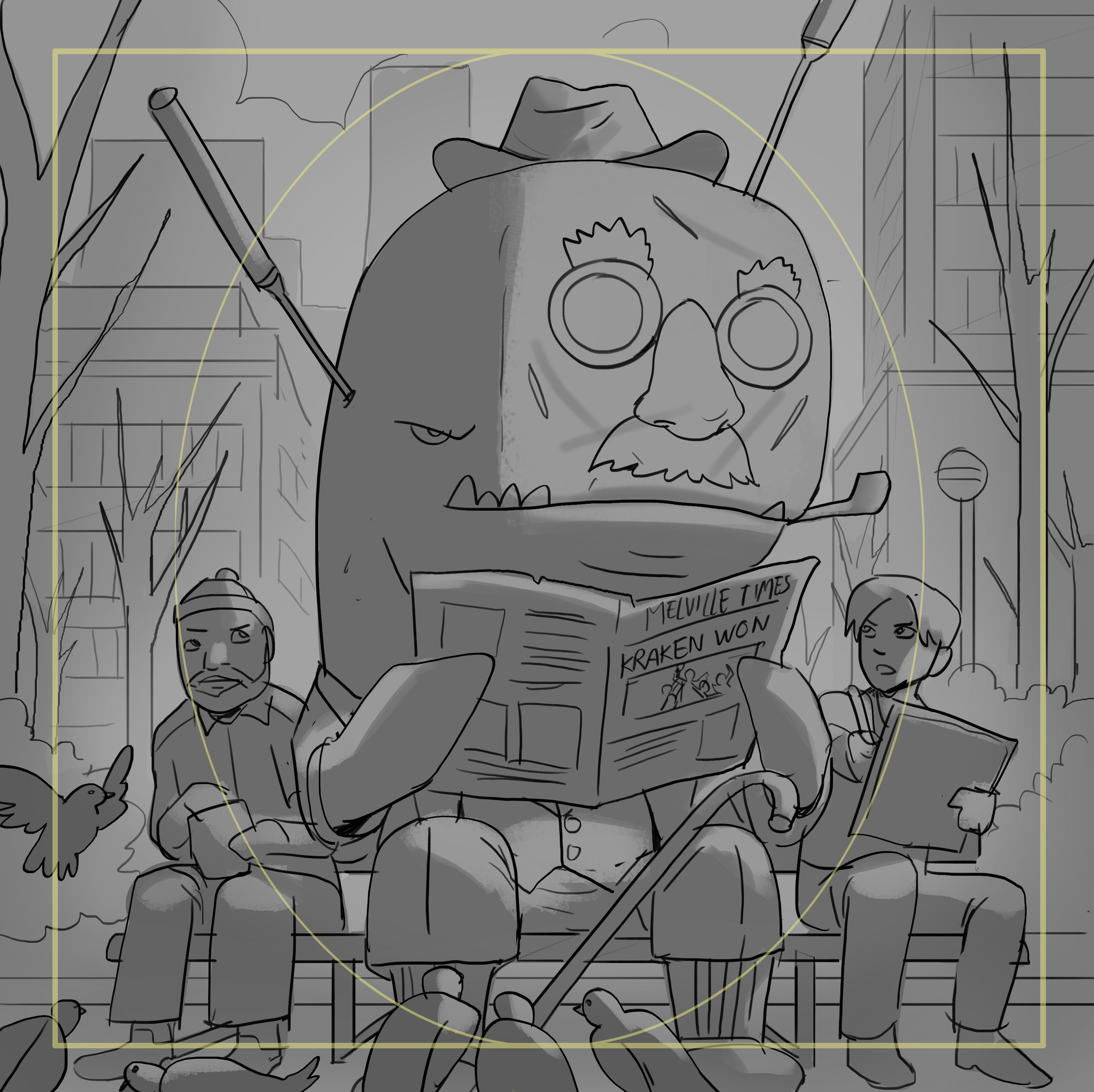
We all loved this version and gave the go-ahead for the colored version. The coloring assignment was given to our artist Wirawan Pranoto.
After the sketch stage is approved, the artist shows us a rough colored version, to see if everything is going well before finalizing the image. This was Officer Moby’s rough color stage:
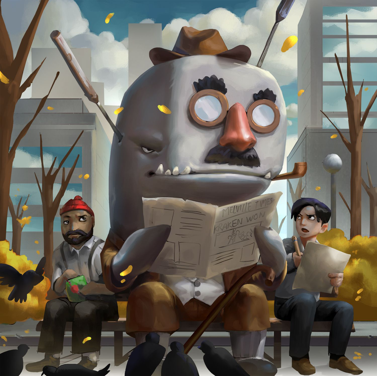
We liked the overall direction, but the trees looked dead as if a fire had burned the park to the ground, so we told him to add more detail to the branches.
Also, we pointed out how the characters didn’t have drop shadows below the bench, so in the final artwork, those were added as well. This was the finished illustration:
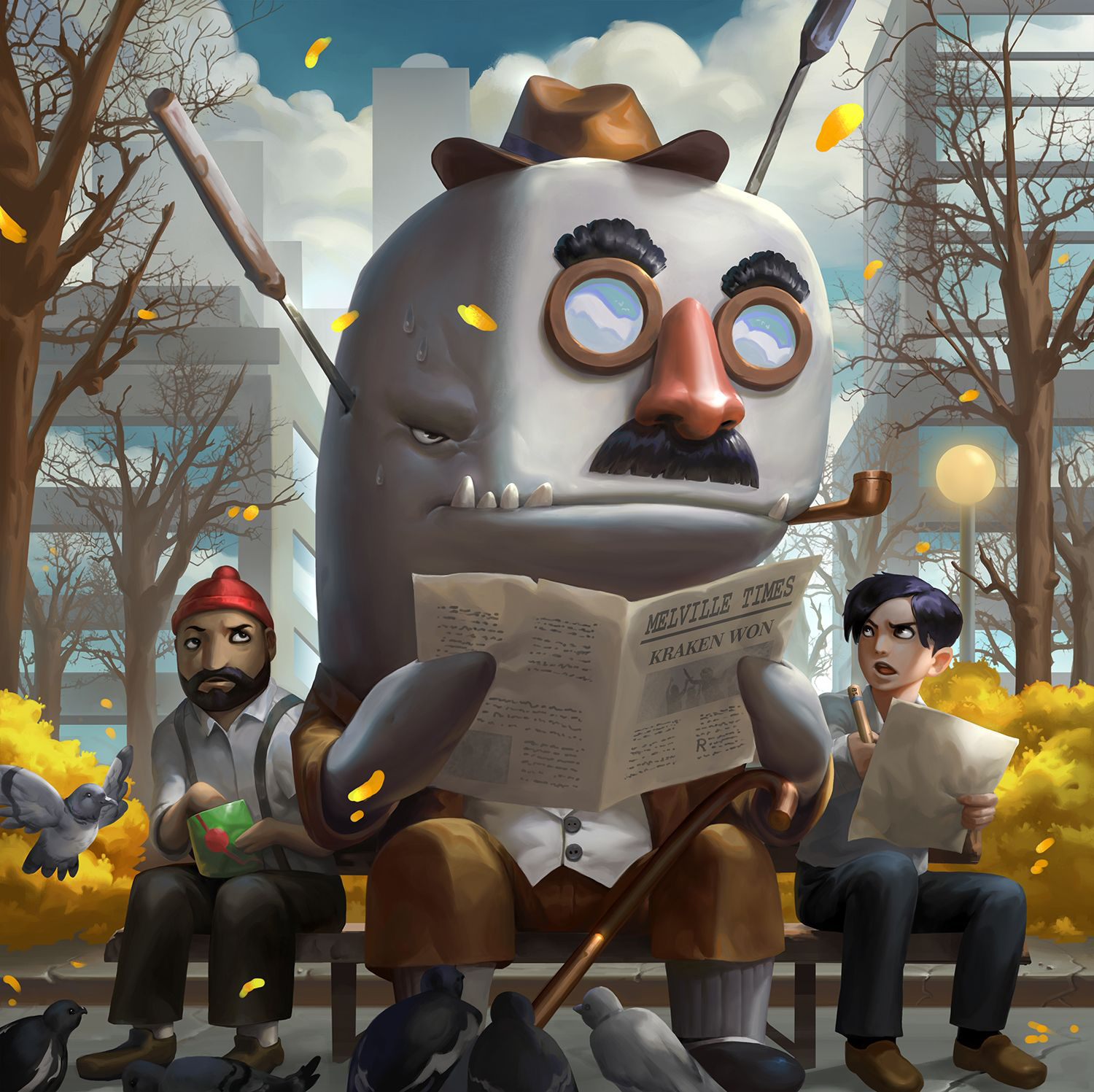
Notice how Moby is reading the Melville Times. Herman Melville was the author of Moby Dick, so this was a nice nod to him added by Kevin 😀
The two characters on either side of Moby are references as well – the guy on left is based on Steve Zissou from Life Aquatic, while the one on the right is is Jack Dawson from Titanic!
We have many different artists that specialize in different styles, so in order to keep the overall style of ScreenPlay uniform we sometimes need to mix and match artists during the art process.
For example, let’s look at the trope card Puffer’s Switch.
We knew we wanted a funny pufferfish opera singer character to feature prominently on the art, so we tasked our artist and designer Sheryl Chieng with designing the look of the character.
After receiving the brief description for the card, she came back to us with two inked sketches for the pufferfish:
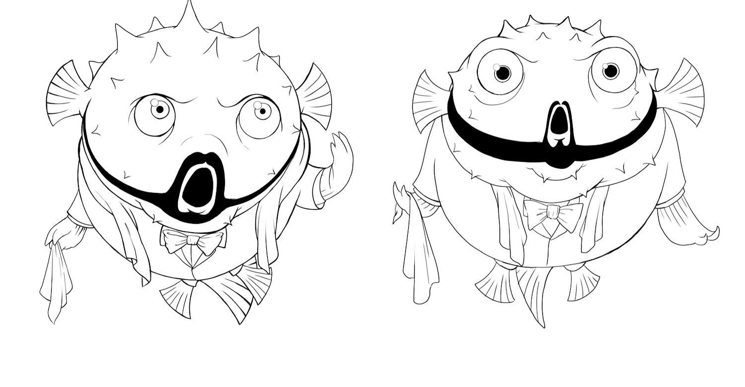
We liked the look of the first sketch, except for the eyes. The large pupils of the fish on the right felt more friendly and funny, so with a small change to the pupils we gave her the go-ahead to add a theater stage background to the image.
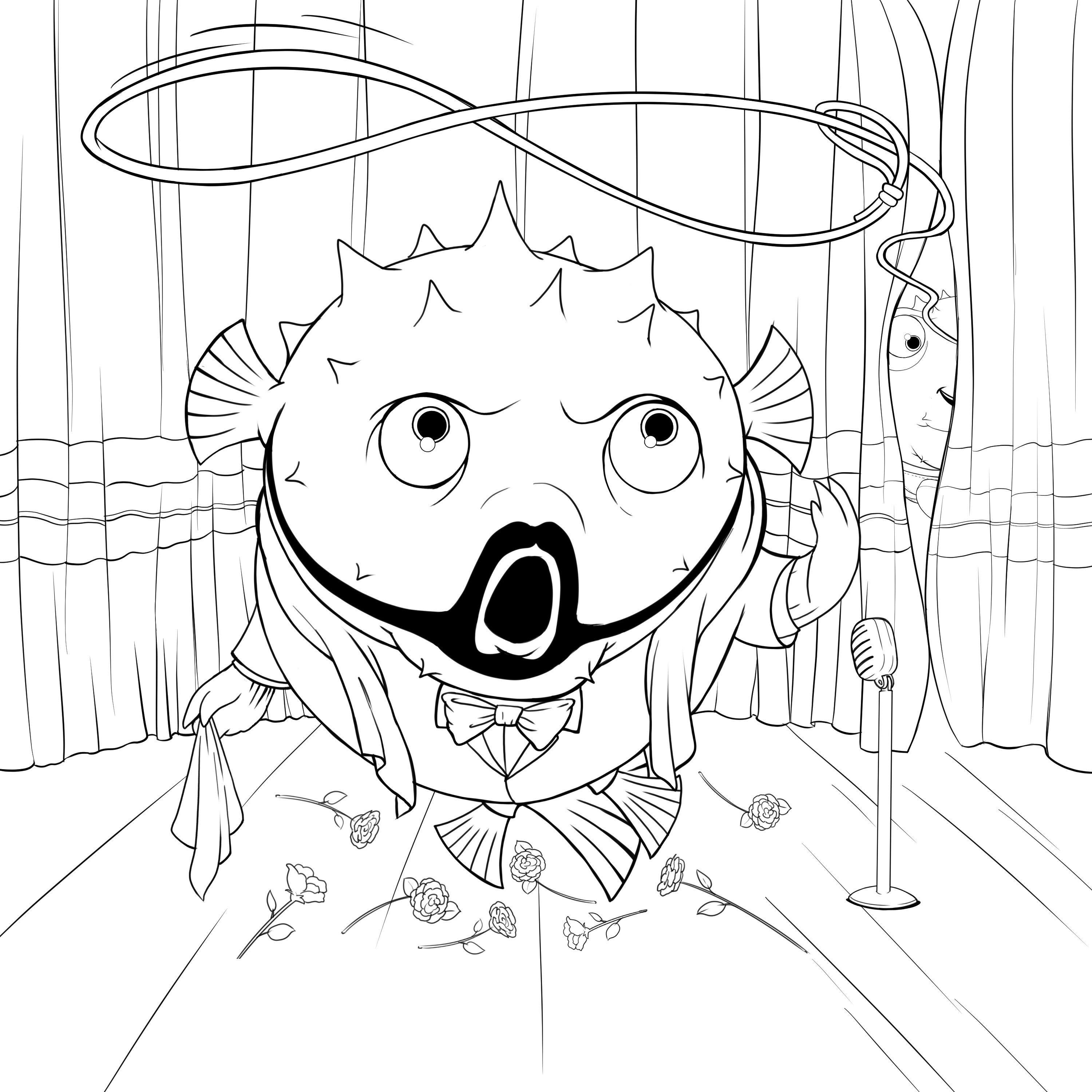
With that, the sketch stage was completed. We gave the artwork over to another one of our artists, Nathaniel Himawan, for coloring. Midway through the coloring process he sent us an update:
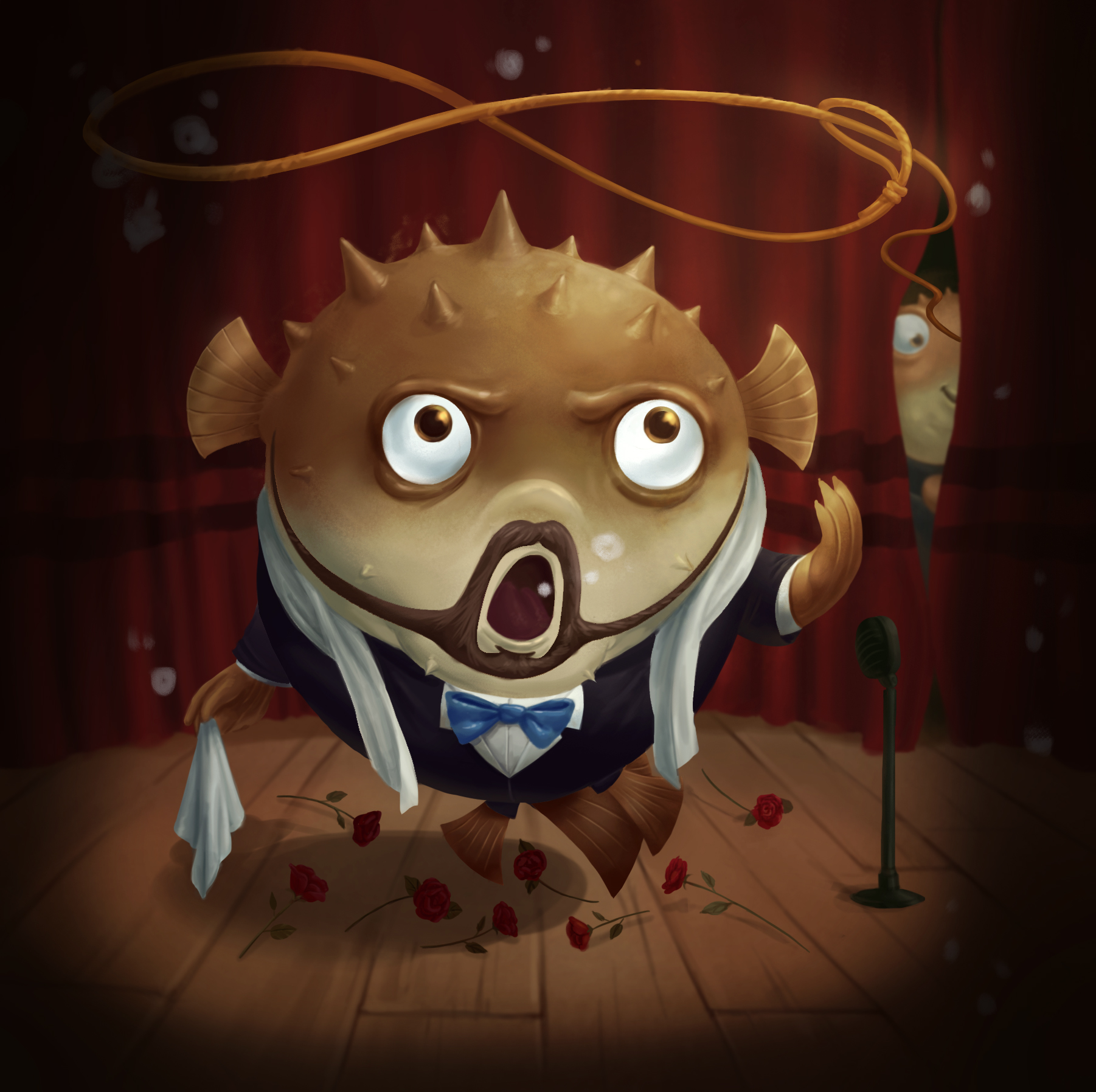
Sometimes midway through the art process you realize certain things that you didn’t think of before. With Nathaniel adding bubbles to the image, we figured that setting the scene underwater made a lot of sense, so we asked him to color the artwork like the pufferfish is underwater.
We also realized that the microphone on the right looked pretty dull, and it got lost in the background, so we told him to redesign it to make it more interesting and make it pop more. This is the final artwork that he delivered to us:
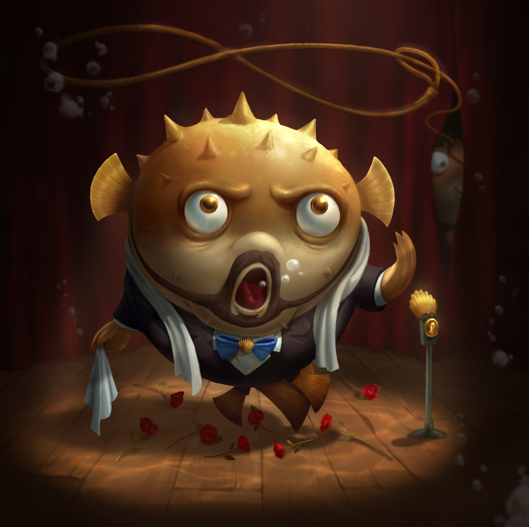
In the end, even though the art process varies significantly, the two final images still feel like they belong in the same universe! 😀

